Challenge: Guide people to their destinations subtly. Subtract the extraneous choices, demands and clutter that afflict most navigation tools.
Challenge: Invent an Internet of Things / Augmented Reality tool that does a useful job better than smartphones, tablets and laptops.
Google Maps is great for finding a new place in an unfamiliar city. It shows you every turn, it calculates your transit fare, it predicts your trip’s duration.
But if you live in a big city and use transit, you usually don’t need all that. You know how to get to work, to school, to your favorite restaurant.
You just need to know: Which line will get me there fastest right now?
TrainLight reveals that at a glance. No swipes, no taps. No interrupting your train of thought. Just glance up as you head out.
TrainLight doing its thing above our door.
(Sped up 15X to show color changes).
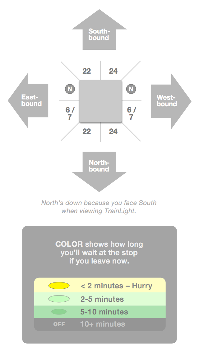
TrainLight legend.
TrainLight shows live arrival predictions for the eight nearest bus and train stops.
The legend introduces TrainLight to houseguests. After a day or two, they no longer need the legend. The interface almost completely disappears – especially for the people who live in the house. (They already know that the 22 and 24 go north and south. They know to turn left after the front door to reach the 22 stop, or right to reach the 24. And so on.)
I tailored transit predictions to our house. TrainLight accounts for precisely how long it takes to walk to each stop from the front door, plus the time it takes to walk downstairs – and even to put on your shoes. (We leave our shoes by the door.)
Call this part of the Internet of Things. Or call it a physical prototype of an Augmented Reality service. It’s both. Those concepts aren’t that different. Whether we use physical installations like TrainLight, or virtual light field tech, or other means, we’re painting the world with information.
Just as networked tech escaped the desktop to embody smartphones, it’s migrating to all the spaces and places we inhabit. We need to steer that migration mindfully.
Subtlety is a vital goal. When tech lives all around us, it should require minimal attention when we need it, and it should be easy to ignore when we don’t. You must focus to understand TrainLight the first time you encounter it, but then it fades into the background. It was shaped by a fundamentally different design approach from those used for traditional apps and web sites.
Hardware
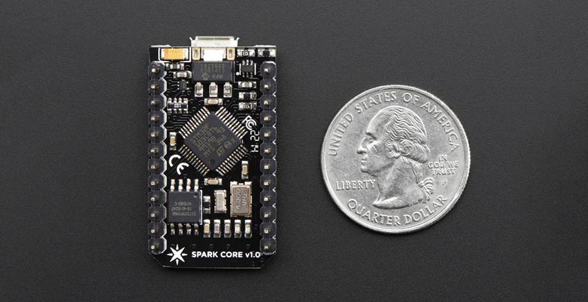
- A Spark Core – a simple Arduino-like microcontroller with wi-fi built in.
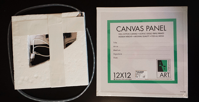
- A strip of 60 LED lights.
- A small artist’s canvas to overhang, diffuse and reflect the LEDs, glued with spray adhesive to:
- A sheet of foam core carved to mount the LEDs and to conceal and protect the electronics.
Software
- On my server: A program continuously grabs train and bus arrival time predictions for the 8 nearest stops and sends them to TrainLight. It draws the prediction data from the local transit agency, via the RESTbus JSON API for the NextBus MUNI prediction feed. It calibrates the arrival predictions to account for the time it takes to walk from our house to each stop. Then it sends the tailored predictions to the TrainLight device.
This was written in C++.The latest version’s written in Ruby. - On TrainLight: The firmware receives the data from the server and lights the LEDs accordingly. This is built using Wiring, a C++ based platform for developing Arduino applications. TrainLight’s firmware uses libraries from Spark for the microcontroller, and from Adafruit and FastLED to efficiently control the LEDs.
Credit due: I designed this all and I built most of the software. But “building” mostly meant snapping together Lego blocks that were already in front of me – bits of code I found online, with coding help and tips from discussion forums, as well as from a couple of C++ and Wiring specialists that I hired from Fiverr and Guru to get me out of messes. Special thanks to Dav Yaginuma for volunteering to rewrite the server-side parsing code in Ruby. (The first version, in C++, worked fine but wasn’t really portable.)
You can build stuff like this! You don’t have to be a pro software developer to make it happen.
Design Evolution
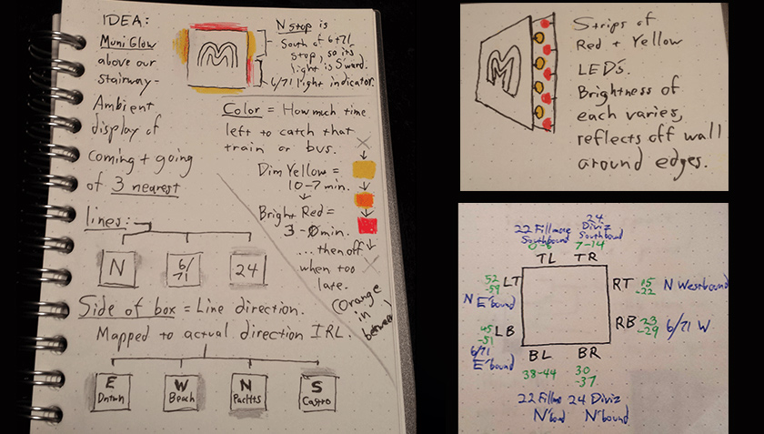
First sketches.
The first rough prototype. Far from the goal of subtlety.
At first there was too much going on. The lights were too bright. Three ugly primary color signals, plus “off,” were too much. And the colors mixed at the edges, creating meaningless extra colors. The transit icon was unnecessary too. It was time to subtract.
Plenty of tweaks and iterations followed:
- I simplified the color scheme. Now it’s just gradations of green, plus “off,” plus yellow as the highlight color. This is more subtle and it fits in better with our hallway colors. It also maps better to stoplight color behavior: green means “go,” yellow means “last chance – go right away or wait.”
- I divided the color zones to keep the signals separate and clear. I made dividers out of thick opaque card stock and placed them between the 8 zones to prevent the light reflections from mixing.
- I dimmed the colors and desaturated them a bit – this calmed things down, it reduced the lumpy, rounded look and it made the color zones consistent.
- I published the code and wrote a tutorial explaining where to buy the parts, how to put them together, how to customize the software. Here’s how to build your own TrainLight.
TrainLight now. Improving…
It’s still evolving. Next up:
- Clarify TrainLight’s meaning for houseguests, without adding clutter and distraction for those of us who live here. Now it’s working well for the primary audience, but it’s still too mysterious for visitors, especially since it lacks walking directions to the bus/train stops. Next experiment: Place a small sign with an embedded NFC tag and QR code at the top of the stairs. Make the legend diagram, linked to map directions to each train stop, appear on any smartphone that scans or taps the sign. Note people’s responses and iterate accordingly.
- Smooth the transitions – Fade between colors more gracefully. The goals are (a) to make TrainLight subtler, and (b) to provide more nuanced information at a glance about just how close a train is. (A “stale yellow” is dimmer than a “fresh yellow,” for instance). This may backfire and make the signals too ambiguous. I have to try it and watch how people respond, but I think I can achieve that.
- Make TrainLight dim its LEDs after sunset. And tweak the “night” colors so they can still be distinguished clearly at a glance – so they appear similarly green and yellow when they’re notably dimmer.
Want to build your own TrainLight? Here’s how.